
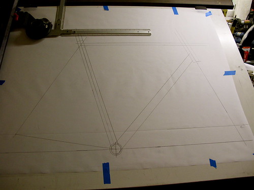
This is the frame drawing, I know you can't see much in the way of details from this photo, but trust me it's all there.
In the last post I speculated that the main tubes were going to be assymetrical, however to my relief I found out yesterday that they are not. Just plain old round Columbus Zona.
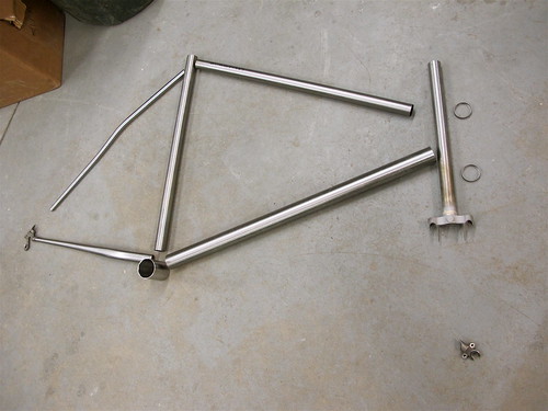 That downtube is 35.0 because as I previously mentioned, I am a fucking beefcake. (Also in case you wanted to know, I have renamed my thighs. Formerly "thunder and lightning," now christened "Bebop and Rocksteady." Y'all just jealous because you didn't think* of it first.)
*Admission: Ben S. thought of it first
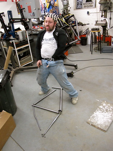
This is Erik just being himself.
(ten to one says that he sticks his dick in at least one of my tubes before he hands that frame over)
On this visit to the shop we also started discussing paint and decal options. More on my paint search in the next post in this series, but for now here are the decal options available to me:
Polished outline - would look sweet with the polished fork crown and dropouts
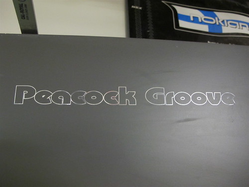
Outline
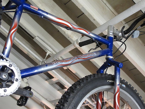
Peacock Groove solid
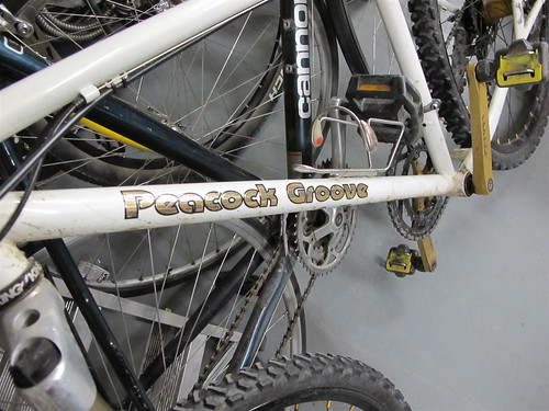
Hand lettered script font
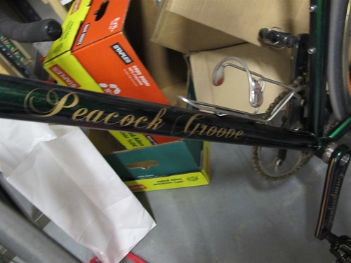
If I go with a solid black and polished look, that polished outline might look awesome, otherwise it's going to be the solid PG font. That to me is what a Peacock Groove should look like.
Previously
Tubes
Fork and Dropouts
Bottom Bracket
The Clock Starts Ticking
Dropouts, Chainstays, Fork Crown
Part #1
1 comment:
I have been following this since the beginning and I think the solid font will be the best. Also lets others that see you riding that you have a custom PG bike and they don't. looking good though, can't wait to see the final thing!
Post a Comment